Opto 22 groov EPIC Learning Center groovView IO Status Programming

Introduction to groovView
The groov EPIC controller from Opto 22 comes packed with various software packages. Out of the box, the user is given full access to groovView, an HMI builder available through the browser. Through groovView, the user is able to create HMI layouts that interface inputs, outputs as well as internal tags of the controller. By creating a base program for the Learning Center, SolisPLC deployed an easy-to-use interface that allows monitoring as well as trending of the inputs and outputs of the learning center. Furthermore, this program can be easily extended to any groov EPIC configuration and give quick access to those who need to troubleshoot IO in the field.
Downloading the Project Files
We've made the screens in this tutorial available to the public. If you wish to download the project and try it for yourself, or even modify it for your application, you may do so by visiting the link below:
Opto 22 groovView Project Files
Once you've downloaded the project, you may deploy it onto the Opto 22 processor by using the restore feature within groovView.
Working with groovView
As mentioned above, groovView is pre-installed and available immediately with the groov EPIC controller. By connecting to the IP address set on the controller, the user is able to access the groovView editor through a browser. Accessing groovView from the controller LCD will bring up the application currently running on the controller.
groovView is accessed from the “Home” screen of groovManage of the controller.
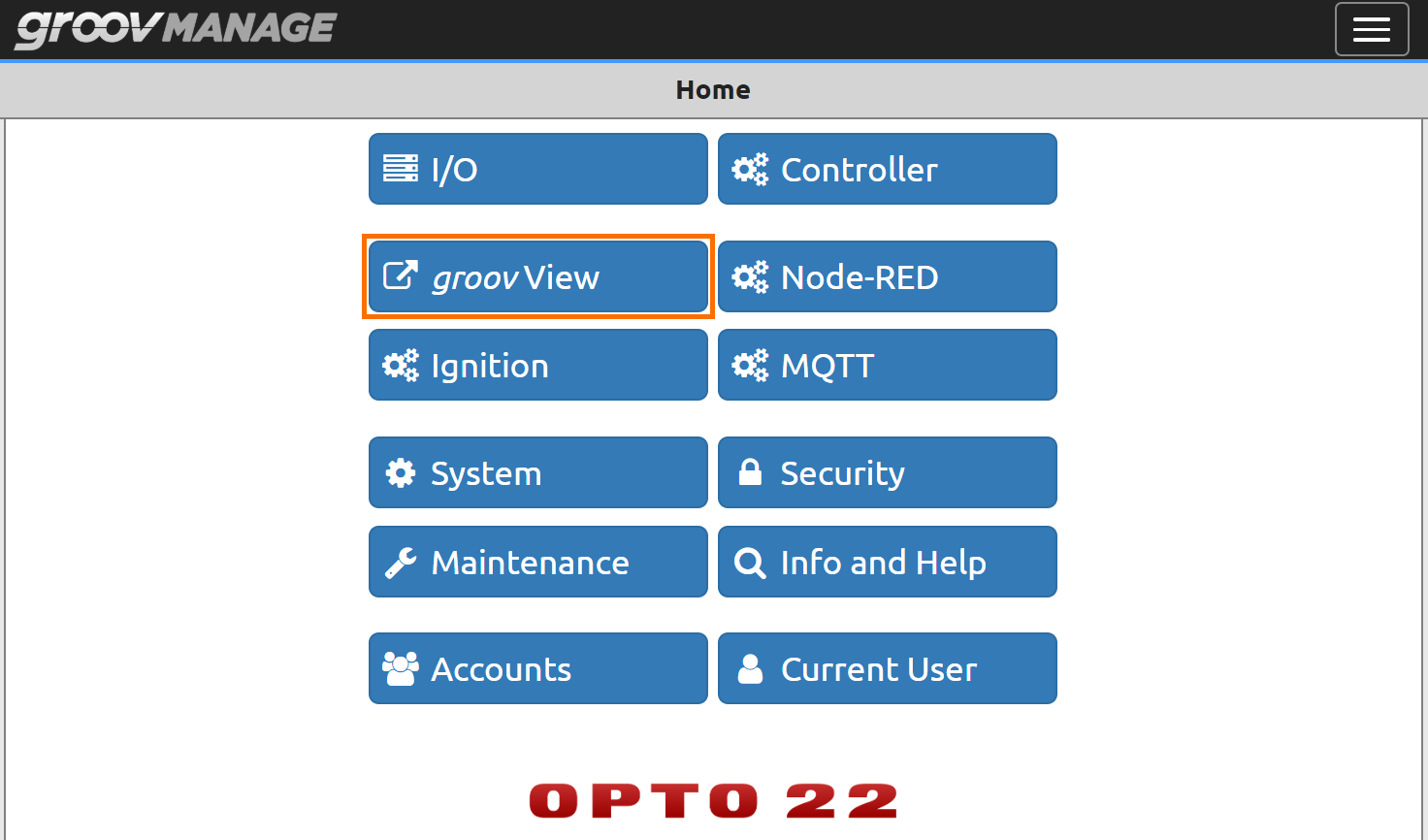
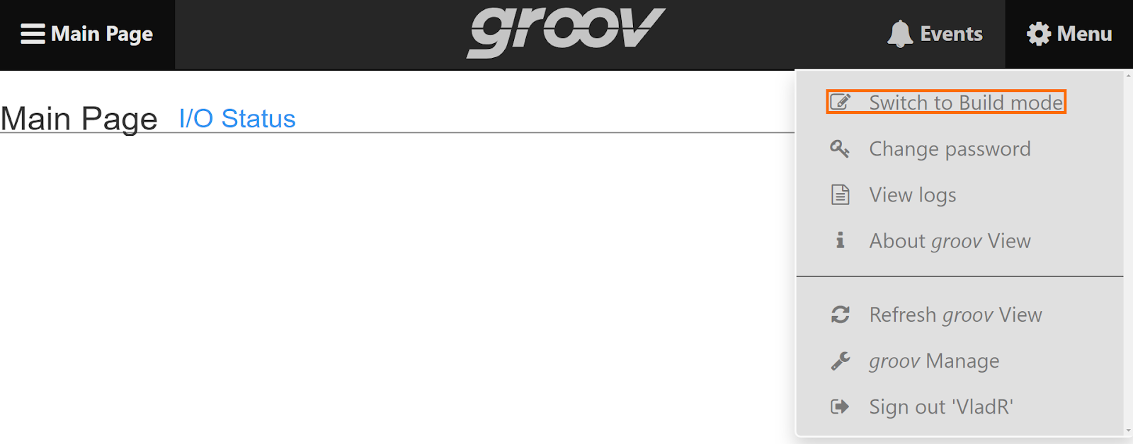
Once groovView is launched, the user will be presented with the current application running on the controller. By accessing the properties menu, the user is able to select “Switch to Build mode” function that will bring the user into the groovView editor.
The groovView editor has many capabilities common to many HMI builders.
Main Components of groovView
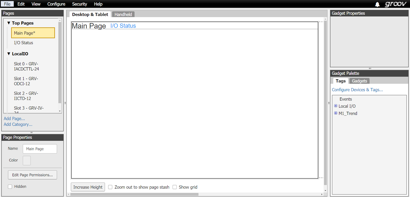
1 - Pages | In this section, the user can add additional screens, or pages for the application. They are not tied by default. The user can establish navigation between the pages through the use of “Gadgets”.
2 - Page Properties | In this section, the user can change the properties of the current page.
3 - Main Editor Window | In this section, the user will be shown the current page they are working on. The editor allows the user to relocate items, access their properties, position them in the 3D plane and more.
4 - Gadget Properties | In this section, the user is given access to the settings of the selected element. Each panel will differ depending on the element chosen within the main editor window.
5 - Gadget Palette | In this section, the user is able to work with the tags currently defined within the system as well as “Gadgets” which are building blocks of the HMI system.
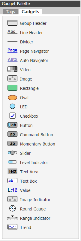
groovView Gadgets and Editor
As stated above, groovView utilizes gadgets as the main elements of the screen. Although the options available may seem limited at first glance, the parameters of each element extend functionality and provide a complete solution for the user. It’s easy to work with and very light-weight for what it offers.
Building an IO Status and Trend Screens in groovView
As the first step in every HMI design process paired with a PLC system, it’s good practice to create a view for every input and output module that resides in the system. This ensures that those who commission and troubleshoot the system in the field, are able to see the status of various bits via the HMI and act accordingly.
By building these simple screens, the user can become familiar with the functionalities of groovView, design on “Desktop & Tablet” versus “Handheld”, page navigation as well as tag trending.
Note that it is possible to view the status of the input and output modules through groovManage. However, this application extends the functionality through trends as well as a mobile solution that is better designed to view the status of the tags without the need to be logged in as an administrator into the system.
Step 1 - Page Navigation
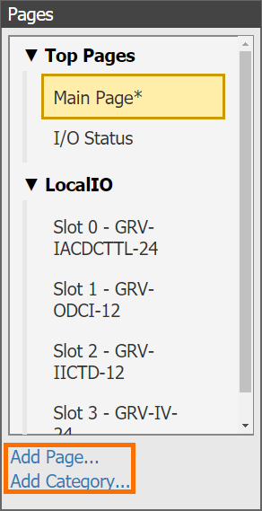
From the “Pages” menu, the user can add new pages and categories. “Categories” are meant to organize the pages for easier management and design.
We will start our HMI layout by defining a main page and an “I/O Status” page. In a typical HMI application, the “I/O Status” page would display all the IO within the system and allow the user to either see the status directly, or to browse to individual cards that would display the status of that specific card. Here’s a simple design of the “I/O Status” page that links to the 4 cards we have in the groov EPIC Learning Center:

Note that the page is only meant to link the user to the individual IO cards in slots 0, 1, 2 and 3 of the controller. Therefore, the gadgets used in the implementation are as follow:
- Line Header | Used for the page title.
- Page Navigator | Used as the link to the “Main Page” as well as each slot page.
The groov EPIC Learning Center comes with four input and output cards shown above. By navigating to the appropriate page, we observe the following design for the card in slot 0:
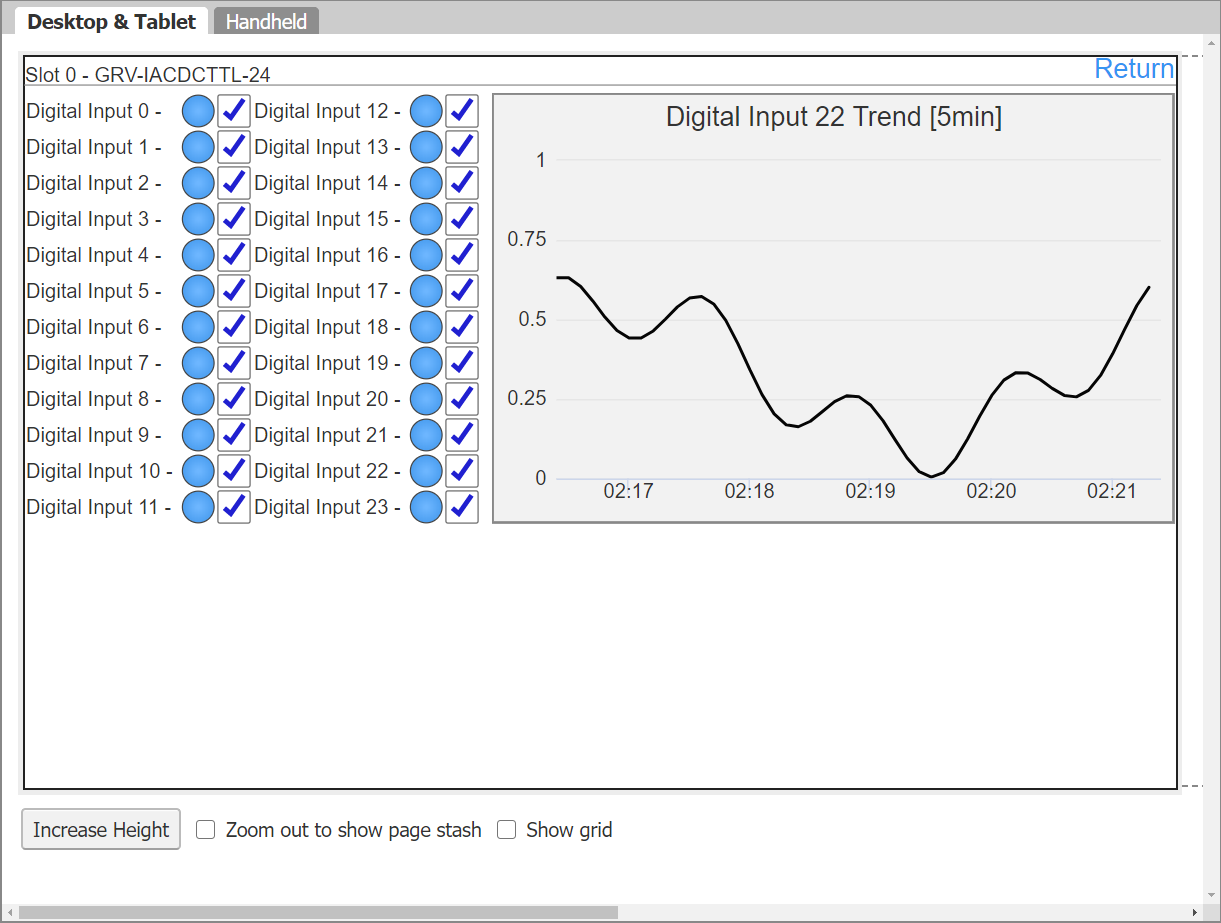
On the screen above, we’ve got multiple elements. Let’s go over each one and how it has been configured.
LED Gadget element in groovView
The LED Gadget element is your basic status indicator. When tied to a tag, the user will be shown the title of the tag as well as an ON/OFF status. The label (text) as well as the color of the status indicator are fully customizable.
In our application, we’ve tied the status of each element to the appropriate digital tag that represents the status of each input on slot 0.
Here’s an example for “Digital Input 0”
Checkbox Element in GroovView
The Checkbox element is tied to a boolean tag that will change from a LOW to a HIGH status when clicked and vice versa.
The use of the Checkbox element in this application is to display the trend window for a specific tag. In other words, once the checkbox is marked, an internal bit is set to HIGH. Once that bit is detected as HIGH, the trend element is displayed. The checkbox element only takes care of updating the PLC bit. Here’s how it is created:
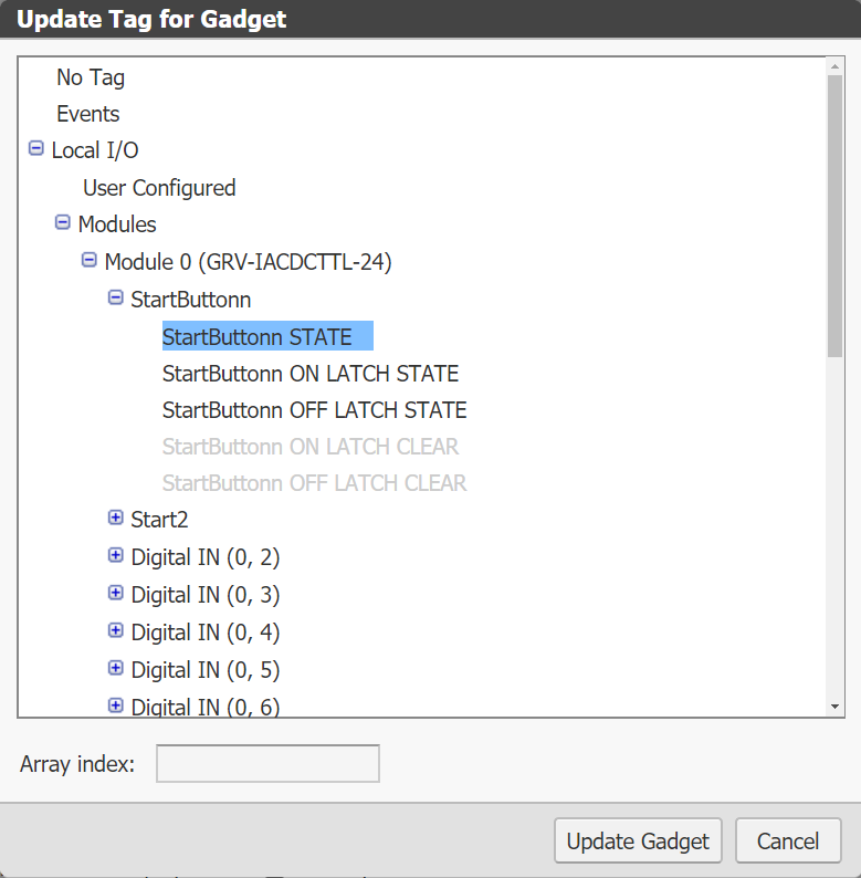
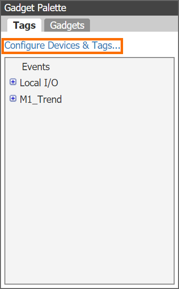
Step 1 - From the “Gadget Palette”, select “Configure Devices & Tags…”
Step 2 - Select “Add New Device” and add a new “Data Store” element.
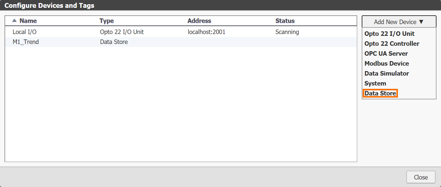
Step 3 - Click the “+” sign to add a new tag.
Step 4 - Give the tag a name and choose the tag to be of type “Boolean” (for this purpose).
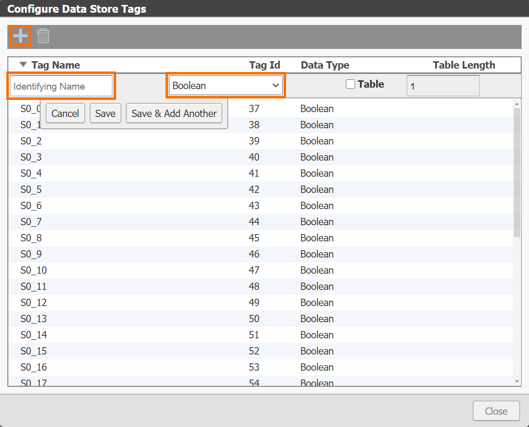
The tag you’ve added to the list must be added to the “Tag” field of the Checkbox element in order to be toggled once the Checkbox is selected by the user.
Building Trends in groovView
Trends are a critical element of system troubleshooting. They’re a visual of the current value of the tag at any given time. Trends are useful for digital and analog tags alike.
Step 1 - Drag a "Trend" element onto the view.
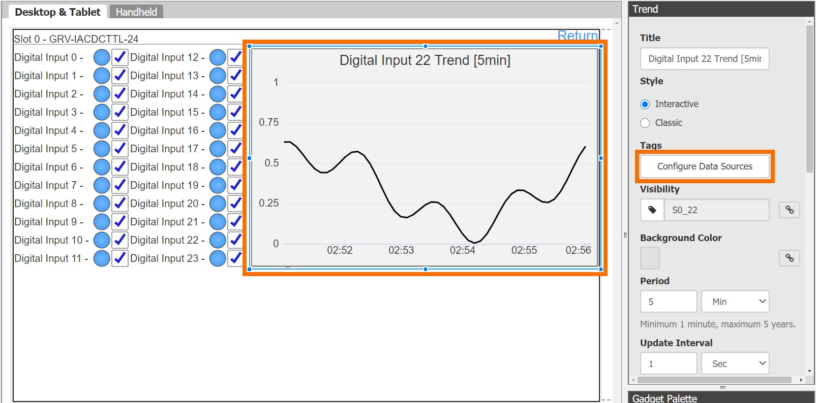
Step 2 - Select "Configure Data Sources" under the Settings tab.
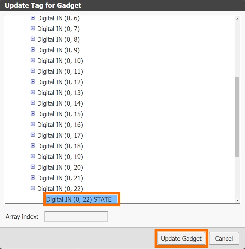
Step 3 - Click on the tag name in order to browse to the tag you wish to trend. Note: a single trend in groovView can be used to display up to four different tags.
[Optional] Step 4 - Click on "Add Pen" if you wish to add additional tags to the trend element. Configure the pens using Steps 1 through 3 above.
groovView Desktop & Tablet vs Handheld Displays
groovView was designed to work on desktop as well as mobile browsers. The designer is built in a way to allow the programmer to create each view separately. By navigating to the "Handheld" tab of the designed, a smaller view, suitable for handheld devices is revealed.
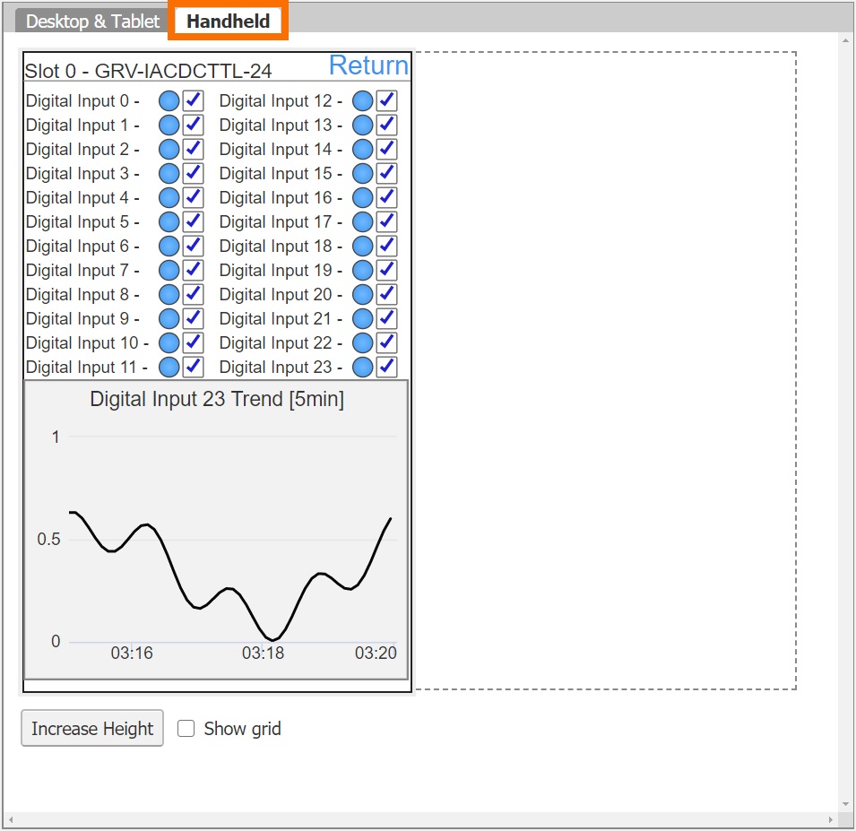
Although the view is smaller, groovView allows the user to "Increase Height" that will provide an "infinite" scroll for the user. In other words, it is possible to design a page that would scroll from top to bottom and reveal every element placed.
The process of designing a handheld version of the interface is semi-manual. The elements are placed according to what they have been layed out in the "Desktop & Tablet" section. However, the placement isn't perfect and requires manual intervention to get the elements positioned nicely.
Conclusion
The groovView editor provides an excellent interface for designing Human Machine Interfaces (HMIs) for the groovEpic PAC. The user can easily create full-featured screens that help the operators utilize the system, see the status of various inputs, outputs, alarms and much more. The designer will run without the need for any additional software and can be used to create views for desktop and handheld devices.
A simple first application for your groovEpic experience kit should be an I/O status monitoring display that displays the current I/O status as well as trends of the same. Such a screen provides a simple approach to I/O checkout as well as troubleshooting when deployed into the field.
